Branding + Design

read about

Understanding what makes your offer a “must have” painkiller versus a “nice to have” vitamin is the key to successful marketing.

If your brand and service approach doesn’t represent anything specific?

Then what your clients are “buying” doesn’t much, either.

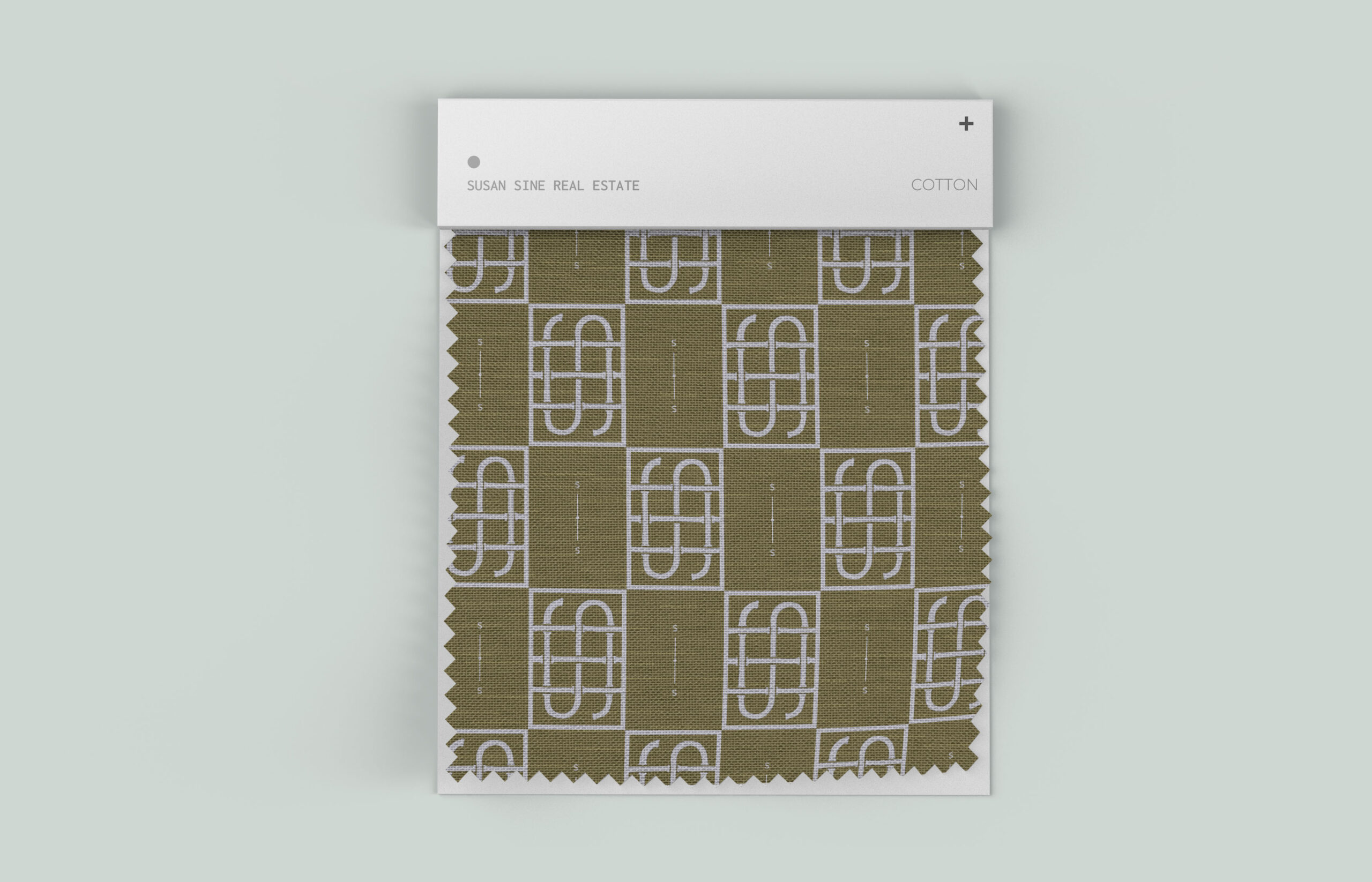
Here are some practical ways our Realtor clients put their custom patterns to use in print + digital marketing to expand brand story, cohesion, and curiosity:

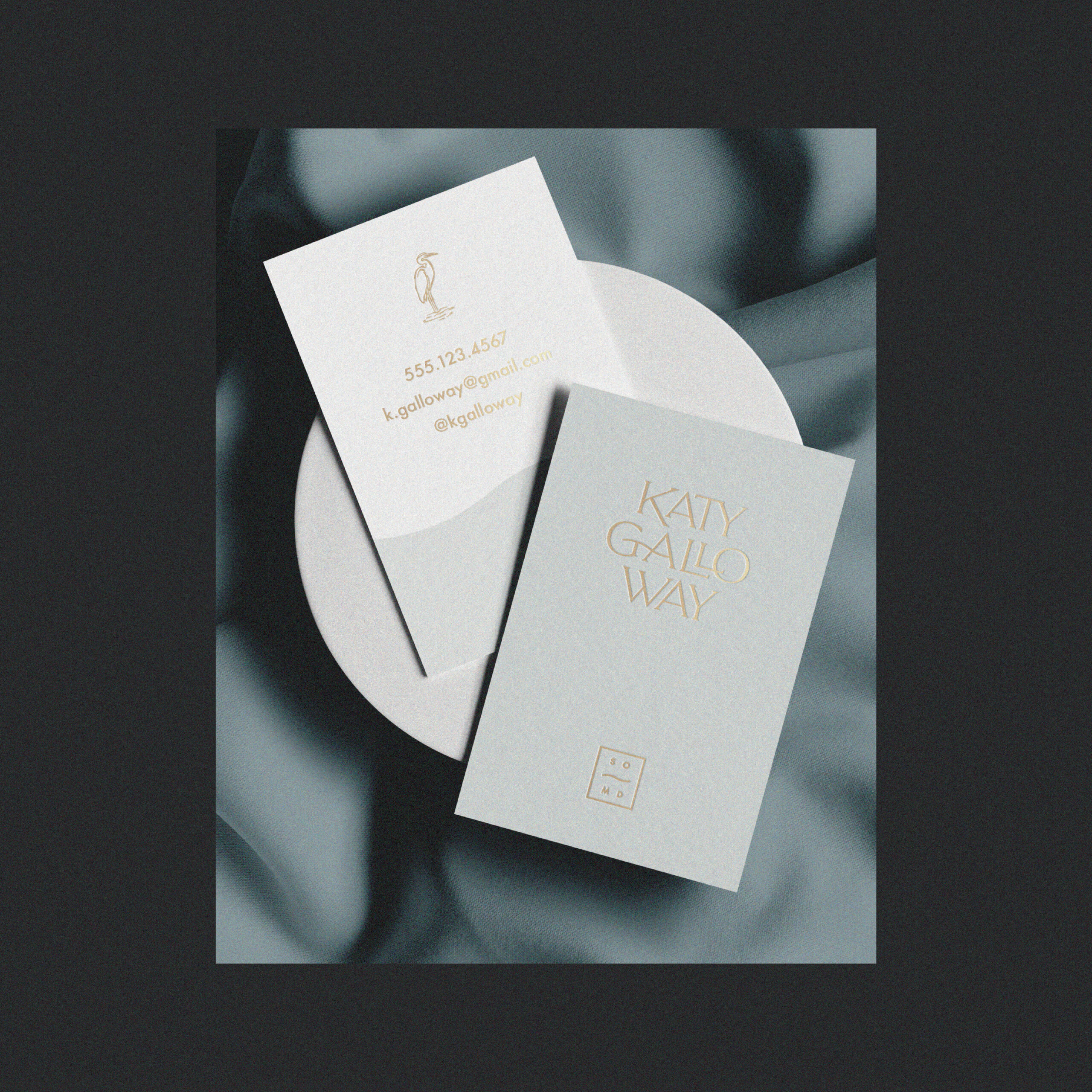
A couple days ago on Instagram, we had the gall to posit that your Realtor business card doesn’t need a headshot image.

Pro photos sell your personality, drive traffic to your online home, and make your audience feel the soul of your brand. They’re a non-negotiable.

If you’re looking for some truly PRACTICAL + actionable tips that you can apply to improve your real estate website this week — this is for you.

Creative Director + Lead Designer Caroline Dominguez Talks Transition from One-Woman Branding Studio to Expanding Services It all started with a bright blue briefcase. I was a Keller Williams Realtor, taking a sharp turn into a new industry outside my journalism and graphic design experience; and I was eager to make my mark. I made […]
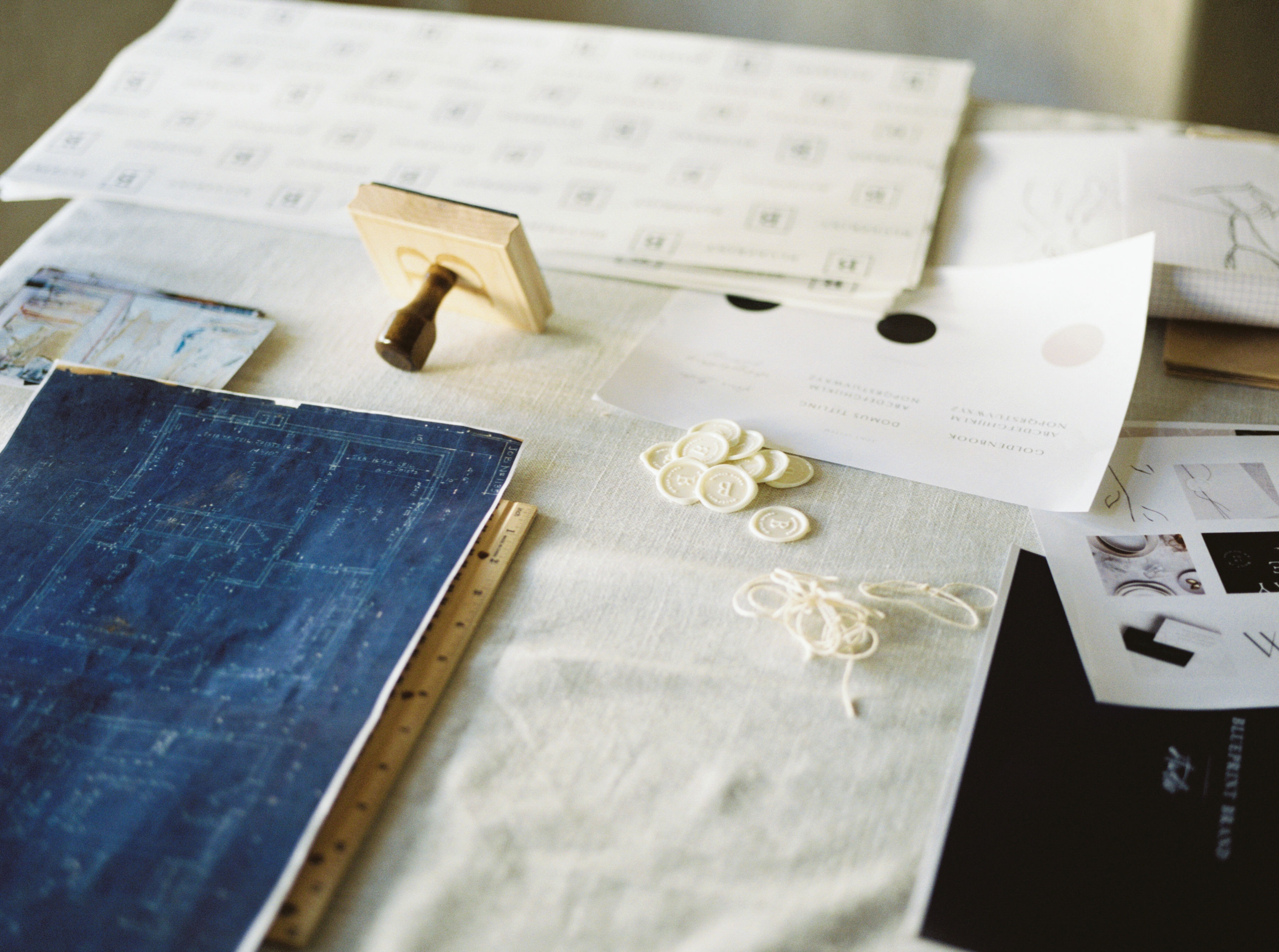

When I am beginning a new project, my clients often ask why I provide so many different designs and what “best practices” are for using them. I realize that not every term I use with my clients has an obvious meaning. So in an effort to demystify some commonly used terms here at BLUEPRINT (or […]